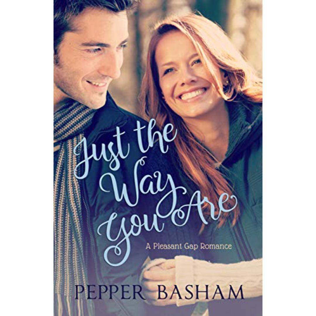
There aren‘t many covers that I absolutely do not like, but this one really bothers me. To me, the guy looks so poorly Photoshopped—his head seems slightly too big, his gaze is off who-knows-where, and I‘m not sure the light hits him quite right—it makes me cringe. (The story is adorable though.) #uglycover #30junebooks
Poet422 Did you notice that she “seems” to be wearing a green jacket, not a vest but her sweater covered arms are easily visible. I think they placed the photo of the female in a “in-house” artwork photo they had in stock. You are right though, nothing matches from left to right. Creepy [shivers like from a sound in the dark]… 6y
BooknerdsLife 😂😂 Good ugly cover choice! I dislike covers with real person on it in general 😅 6y
75 likes2 comments


