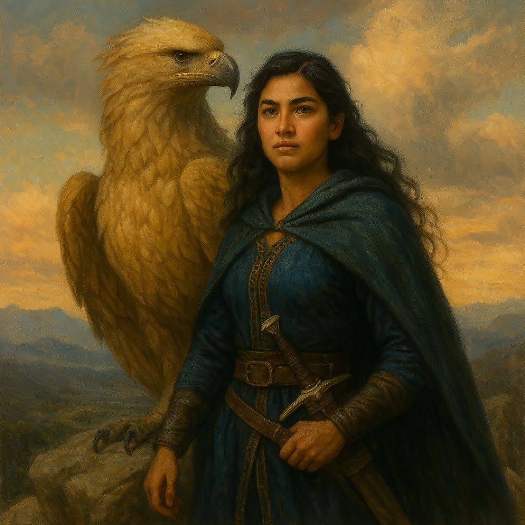
Home Feed
Home
Search
Search
Add Review, Blurb, Quote
Add
Activity
Activity
Profile
Profile
#tod
blurb
Jst1MoreChapter
Tower of Dawn | Sarah J Maas
post image
blurb
The_Heeler_Booklife
Tower of Dawn | Sarah J Maas
post image

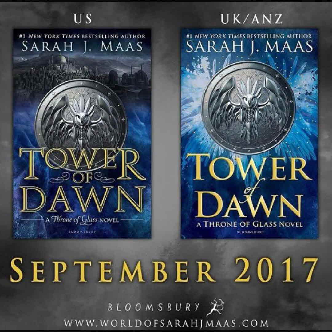
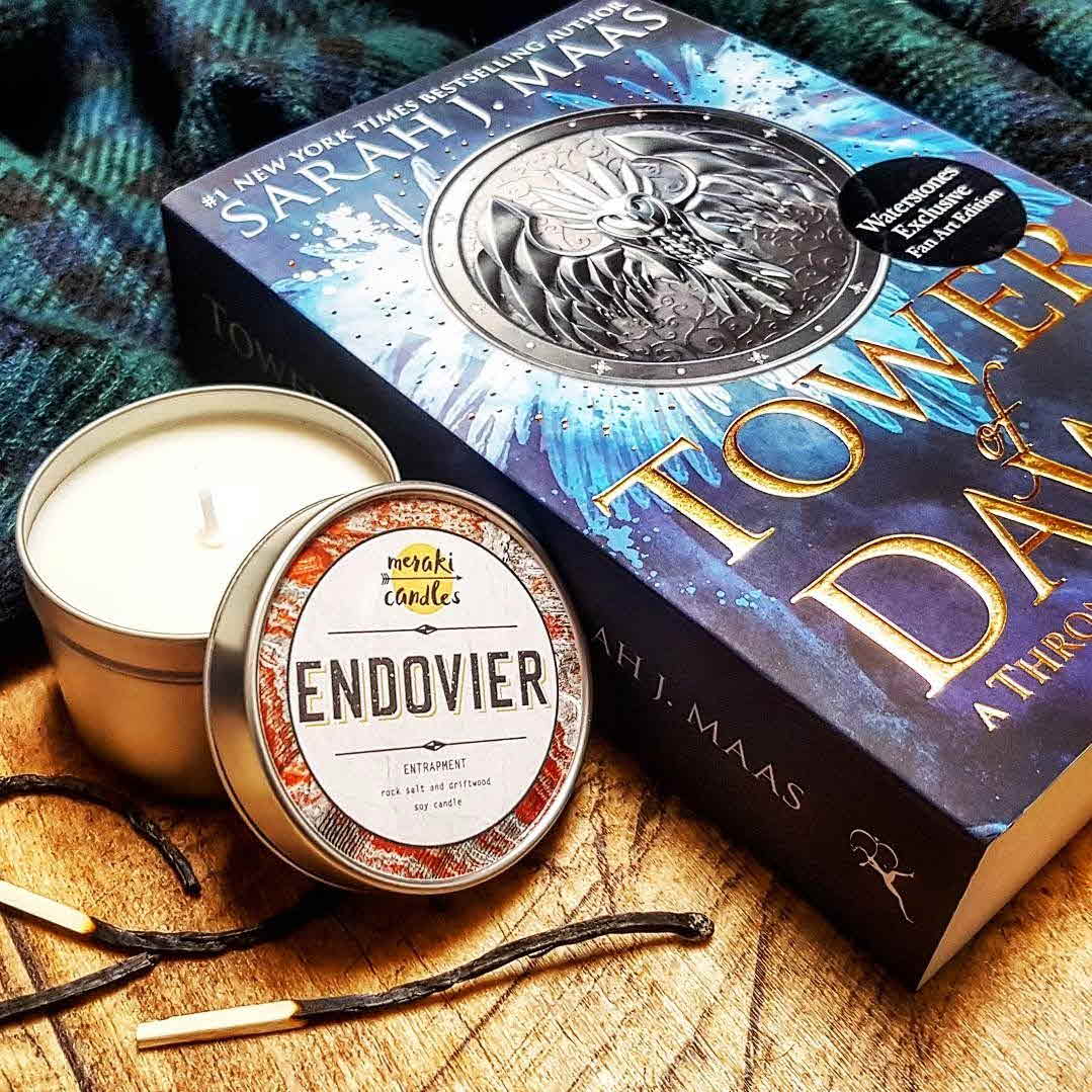
Anyone else feeling a little bit meh about the Tower of Dawn's cover? I think as a standard ya fantasy novel cover it looks good, but for a SJM novel specifically in the TOG series it kind of feels meh to me because it doesn't match the series. What is everyone else's thoughts the US and U.K. covers? #sarahjmaas #sjm #throneofglass #tog #towerofdawn #tod #chaol #chaolwestfall #youngadult #ya #coverreveal #book #series #thoughts

emjmarr I'm the same! I'm a little disappointed. I thought they would keep with the theme they had going with the design for the series but I guess not. It seems to me, especially with the US cover, that they are trying to head to a more adult audience - seems too similar and in line with GOT... 7y
The_Heeler_Booklife @emjmarr That's very true. On the Facebook Throne of Glass Group someone made a fan made cover that looked more like a TOG book. Also, on the same group someone pointed out in the smoke/fog there are faces. Sarah did say there are hints to the book on the cover. I mean that's cool, but I expected more out of the title and cover. I think they were also targeting the male audience with the cover as well. 7y
emjmarr I like the idea of having little hints but surely that could have been done with a more similar style?... I haven't seen the fan cover but must go check it out! I guess also, at the end of the day, I'm after the content more than the cover but it would have been nice to have them all nicely lined up and looking pretty on the shelf. 7y
See All 6 Comments
The_Heeler_Booklife @emjmarr the content is important, but I do think it would be nice for the covers to have a similar pattern because TOD will stick out like a sore thumb next to the other books. It is kind of going to mess with my OCD though because TOG, EOS, HOF, QOS, and EOS all have silver wording while TOD and TAB have Gold writing... 7y
emjmarr I'm the same!! I hate having series printed in different designs and formats!! My Throne of Glass has been given a shadow effect on the spine and none of the others in the series do so I guess it was an earlier design. But yeah, it sticks out too but not as much as TOD will... *sigh* book lover dilemmas 7y
The_Heeler_Booklife @emjmarr with Cassandra Clare's Dark Artifices Series, both of her books have the same color font, but in reverse. So, it bugs my OCD so bad because it is not in the same pattern. 7y
15 likes1 stack add6 comments