Home Feed
Home
Search
Search
Add Review, Blurb, Quote
Add
Activity
Activity
Profile
Profile
#changesedition
blurb
LibrarianRyan
Unwind | Neal Shusterman
post image

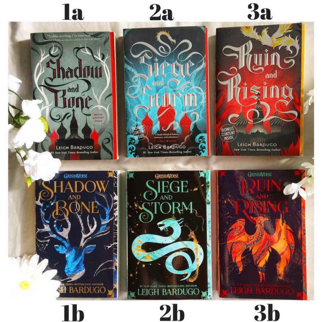
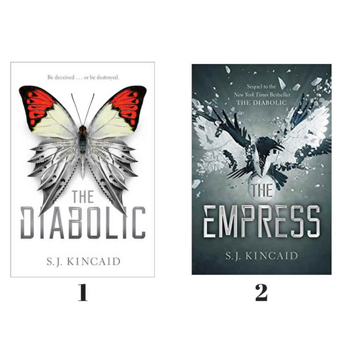
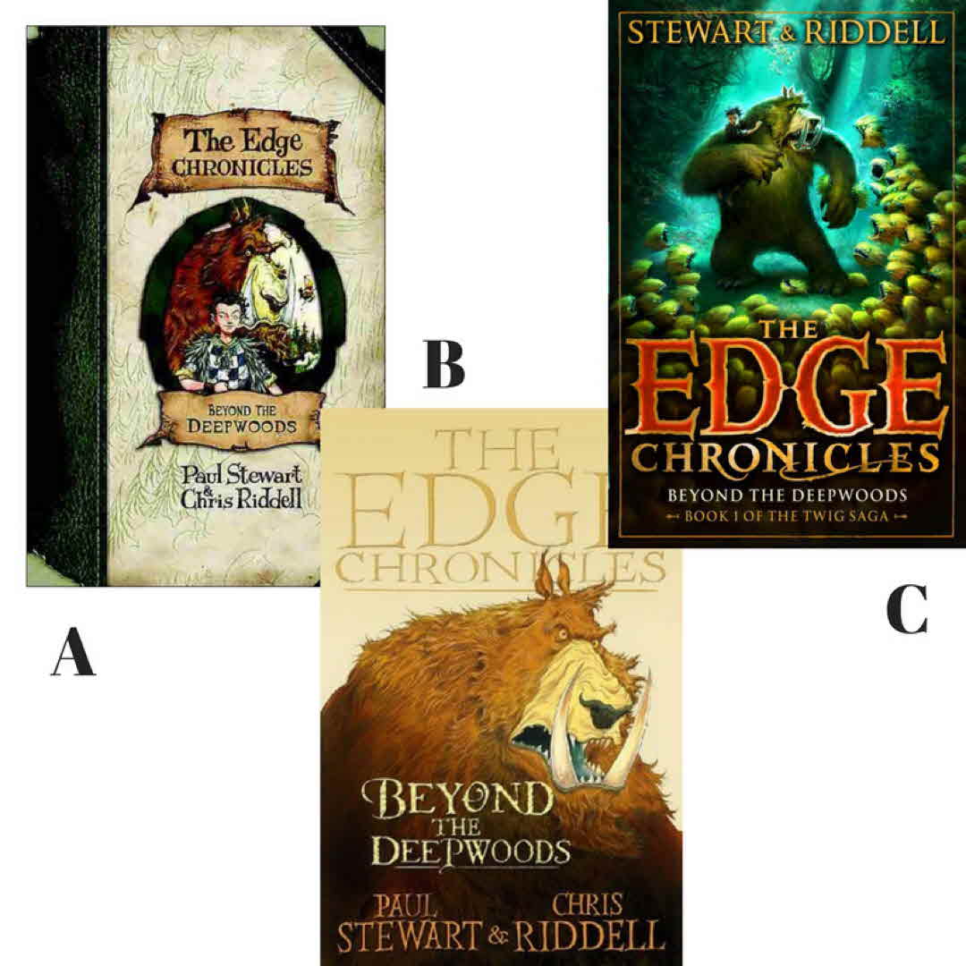
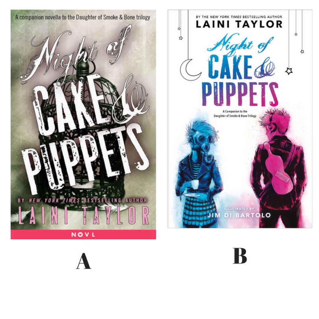
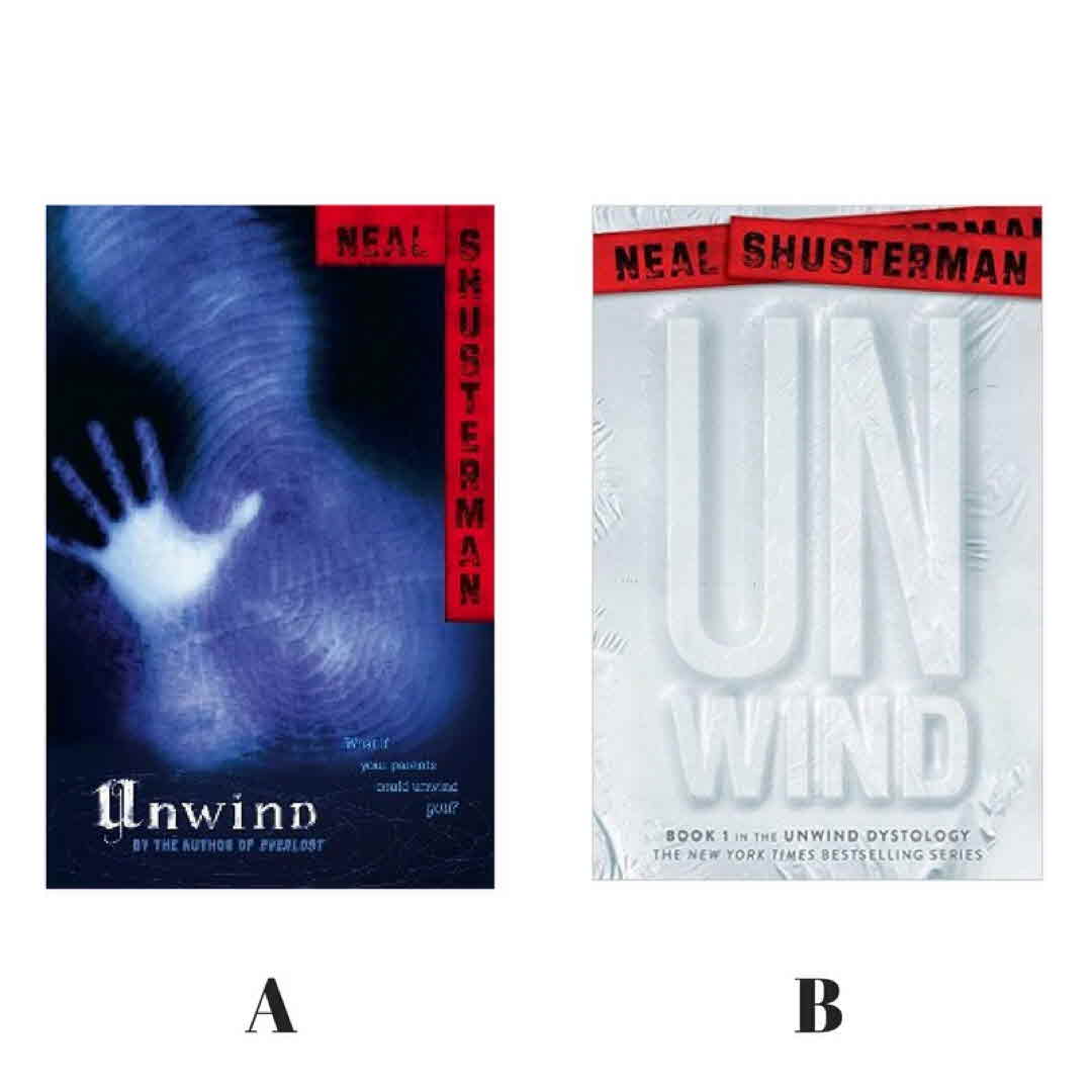
I love the original covers. They get at the creepiness and the fragility inside the story. But the cover redo I think opens it up to more people. #coverlove #changesedition

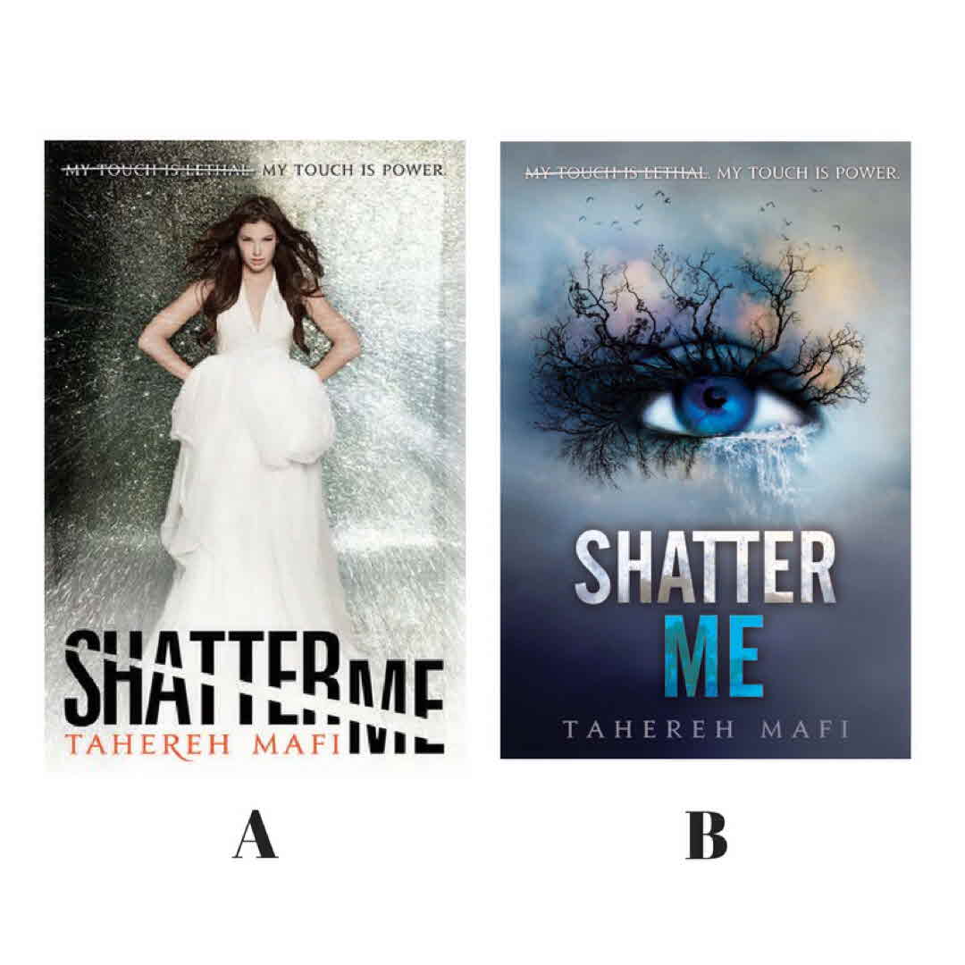
BookishGirl06 I‘m currently reading this actually and I have the one on the left. 6y
LibrarianRyan @BookishGirl06 it's sooooooo good 6y
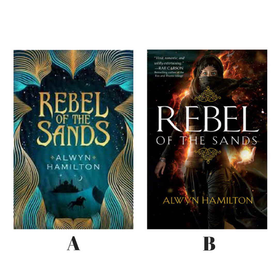
BookFreakOut The new covers definitely look more like modern YA even though they‘re not that old, but I had to collect all the original covers once I realized they were changing them! Consistency, you know. (edited) 6y
Ingerella I have this on my TBR list. It looks so good! I definitely prefer the old cover. 6y
LibrarianRyan @Ingerella it is super good. 6y
64 likes3 stack adds5 comments
blurb
LibrarianRyan
Shadow and Bone | Leigh Bardugo
post image

My last two books are complete series that didn't go for a cover change until after the series wS complete. But I couldn't leave them out. I think the original covers are better, but I own book 1 of the new covers. #coverlove #changesedition

2BR02B I like the typeface of the first better, but prefer the overall design of the second. IMO they should have used a more interesting font when they redid the covers. 6y
Kristyngansen I like these original covers a lot better, too. 6y
Linear The new covers remind me of 90s anime logos. Like fushugiyugi which i no doubt spelt wrong. I like the first edition 6y
See All 8 Comments
Cailey_Mac I want to own both, because I think each set have dramatic covers that are unique to the set! 6y
jfalkens I haven't read them but I like A 6y
Karkar I love both sets. I did not get the old covers in time to get them all. So I have all of the. In the new covers. 6y
GlassAsDiamonds Again with very stupid expat problems but these aren‘t easy to get in India so I sent hubby on a mad chase one day when he was in Singapore on a work trip and ended up with the first two of the old covers and third of the new... 😱😭😱😭😱😭🤯😭 6y
DrizztGirl I love the second covers! Normally I don't care what my covers look like, but these are beautiful! 6y
79 likes8 comments
blurb
LibrarianRyan
Zom-B | Darren Shan
post image

Once again I'm not sure if this is a change in cover art or international editions. I like the original better. Book one was about so much more than just Zombies. #coverlove #changesedition

Linear You know part of the reason why I collect first edition books isn't so much the prestige or anything. It's because that is what I think the author first wanted to put out into the world, that cover art, the words and how they put it together. So to me it's like more authentic or something. Anything after is just commercialism taking over I guess 6y
Linear With that being said I'm still liking the first covers over the second covers in almost everything that you posted. Completely ignoring which one was the one that came out first the first one still end up looking the best 6y
58 likes2 comments
blurb
LibrarianRyan
Zeroes | Scott Westerfeld, Margo Lanagan, Deborah Biancotti
post image

I'm not going to lie. Book 3 could be place holder or international cover. But usually BN only sells the US cover. On google I have seen an O cover but that could be fan art. I guess we'll know when it actually comes out. #coverlove #changesedition

jpmcwisemorgan I think series covers should present a cohesive look. 6y
tonyahoswalt I hate when they change cover styles in the middle of a series. Does not look right on library shelves. 6y
49 likes1 stack add3 comments
blurb
LibrarianRyan
Tiger's Curse | Colleen Houck
post image

Here is another debate between my friend and I. Book one -4 all have an animal on the cover. Book 5 isn't out yet, but it appears the only thing they changed were human. I say no cover change, she said yes. Add fuel to the fire and give me your two cents. #coverlove #changesedition

GondorGirl I'm so sick of attractive humans one the cover of books. Do something more original! I like the animal covers better. They would make the series stand out to me at a bookstore. 6y
LibrarianRyan @GondorGirl I agree. Just once I want a plain Jane on the cover. Sandra Bullock before the miss congeniality make over. 6y
jfalkens I'm just excited it's finally coming out! I do like that they at least stuck with the lattice like design around the top of the book. 6y
54 likes3 comments
blurb
LibrarianRyan
The Diabolic | S. J. Kincaid
post image

So a friend and I Re arguing over if this is a cover change or not. I say yes. The two barely resemble each other. The first as the butterfly with knives for wings and the second a bird coming out of a ball or an egg. I say cover change. What do you say.

#coverlove #changesedition

julesG I would not have seen these as being sequels. I agree to cover change. 6y
Linear I want to see it as a cover change mostly because the fonts in the title is basically the same. I am saying is this book was supposed to be a stand-alone I feel like she just had to come up with something on the spot for a second cover. I wonder if the second cover has multiple editions like the first cover does like there's a black and a white 6y
LibrarianRyan @Linear interesting. I didn't know the book was supposed to be a stand alone. I have it but haven't read it yet. 6y
Linear @LibrarianRyan yeah, it was originally a stand alone, but they decided to make a second book later. I assume fans may have asked how life worked out after the story ended since there was a huge issue not addressed. 6y
Linear Also i text to talked what i said the first time thats supose to say i dont see it as a cover change. 6y
50 likes5 comments
blurb
LibrarianRyan
Beyond the Deepwoods | Paul Stewart, Chris Riddell
post image

I know why this series has different covers. It started out as book a. And I think the first 6 book or so look like a. The Edge Chronicles is one big series, but it's broken up into various sagas as you can see in c. However it has a Narnia problem with which order you should read them. Publication order, saga order, or strait time line order. Thank goodness the list them all on their website. #coverlove #changesedition

Linear Love the first, the second one looks way too much like a child's book versus like a middle school book, and the last looks like a cartoon poster. 6y
LibrarianRyan @Linear never thought of it that way. I like the last book but that may be because I think it more accurately describes the rest of the series when taken as a whole. 6y
43 likes2 comments
blurb
LibrarianRyan
Shatter Me | Tahereh Mafi
post image

Sorry. Had to do some real work. For the after posts of #coverlove #changesedition I shall start with Shatter Me. I love cover b. I haven't read them so I have no idea how well the represent the book. Your thoughts?

Vinjii I had a hard time getting into the prose but thought the story was okay. It‘s a lot like other dystopian YA out there but still interesting 👍 6y
Leniverse I haven't even heard of it until now, but the eye cover is stunning! 6y
GondorGirl The first book is the only one with the human cover. The rest of the series are all various eyes (at least my copies are). I feel the eyes fit the series much better. The human cover looks like the runway of a fashion show... 6y
LibrarianRyan @GondorGirl it does, which is why I think it didn't sell well at first. 6y
Cailey_Mac Omg I LOVED cover B. It really got only nerves that there wasn‘t a hardcover edition of that for the first one, so I just had to make due at the time with the original 6y
44 likes2 stack adds5 comments
blurb
LibrarianRyan
Rebel of the Sands | Alwyn Hamilton
post image

When the first cover came out this was an auto buy. It screamed read me! Then book 2 cover was released and a compleat change, with a change for book one cover. In another boom group this was a highly debated topic. One person even said that the original cover was stereotypical and racist. But I think that distinction belongs to the newer cover. Thoughts?

#coverlove #changesedition

TrishB B looks more stereotypical.... 6y
julesG I wouldn't buy B. It sends negative vibes. Yes, maybe racist vibes. Whereas the first cover has this Arabian Nights, stories and oriental exotic vibe. 6y
Lynnsoprano I agree with you. The first cover is definitely eye catching. The second would make me think twice if I were judging by the cover. It seems to play to stereotypes. 6y
See All 22 Comments
LibrarianRyan @Lynnsoprano @julesG I thought so too. Hate the new covers which has made me not read the series yet. 6y
jfalkens I like A much better 6y
DeborahSmall I don‘t think either cover is racist or stereotypical. If there was a book cover with a guy dressed in khakis wearing a hat and gun holster it would never be considered stereotypical. Based purely on aesthetics/personal preference I love cover A and I‘m planning on buying it 💕 6y
GlassAsDiamonds Is this a cover change or a country one? I‘ve got a new release of the second book in the cover style of the first? (I like the style of A so much better I must say. This whole “must have picture of heroine on cover” thing is slightly annoying). 6y
TsundokuAleax I was so mad when the new cover style was announced. My brother and I were at a book store a few weeks back when I showed him the change. Thankfully he is a smart one and agreed with me. On the plus side, if you are willing to do the work of locating and paying for it, they are still using the old style in the UK. So far I have the first book. 6y
LibrarianRyan @TsundokuAleax I saw that. But I would only find it in paperback. 6y
LibrarianRyan @GlassAsDiamonds these are a cover change for the American covers. Some countries have both editions look like a some countries both editions look like b. 6y
TsundokuAleax @LibrarianRyan totally get that. I sometimes get picky about which version I have (cover art and hardback vs paperback) 6y
Leniverse Cover A looks great. Cover B looks like a video game. 6y
ReadingRover I like A 6y
Itchyfeetreader I bought this based on cover A - not my usual read but I really enjoyed it. He cover looks inviting you just want to jump in ! 6y
SandyW @Leniverse My thoughts exactly! 6y
Skyrimir I like the first one. I don‘t generally like pictures of characters on the cover. I want to imagine what they look like. 6y
GlassAsDiamonds @LibrarianRyan ahhh. That explains it - I‘ve seen the covers in India & the states. India is A, the US was B. 😊😊😊 #expatproblems !! 😊😊 6y
2BR02B B just looks like Throne of Glass with a palate swap. 6y
LibrarianRyan @2BR02B I never thought of that, but now that you said it, I see it. 6y
Cailey_Mac I think they‘re both gorgeous, but as I think about it, I can see how the original cover might be seen that way. 6y
Kar2b The UK version kept with the Book 1 abstract design. I like it so much better! 6y
JoRead Never thought the first one as racist, I still don't think it is. However it looked boring to me. Call me shallow but I wouldn't pick up the book to read the blurb on the cover alone 😅 New one however looks very modern and oh, so kick-a$$ rebel. Yep, I'd read that in a heartbeat 😄 6y
58 likes2 stack adds22 comments
blurb
LibrarianRyan
post image

Originally released as an ebook only companion story, it had a cover similar to its parent series. Just last month it was finally released in print. And has become my favorite cover of the year. Now I want the. To rerelease the rest of the series with matching covers. #coverlove #changesedition

julesG This is a series where I liked the UK editions. The printed edition of the novella, though. I'm in favour of matching covers for the rest of the series. BTW I found that book 1 and book 2 looked very different in style in the UK editions, hence I only bought the first book in print. 6y
LibrarianRyan @julesG I will now have to go look at the U.K. Editions. I think I saw one recently. 6y
Lizpixie That‘s exactly what I want! I have the gorgeous blue & pink Cake and Puppets but I don‘t have any print versions of the trilogy, so I‘m holding out until they release it in the blue & pink editions. 6y
LibrarianRyan @Lizpixie I and me too. 6y
52 likes2 stack adds4 comments